Understanding PNG, SVG, and ICO: A Guide to Usage and Best Practices
It’s challenging to envision contemporary web pages devoid of these petite yet invaluable components – icons. While serving as essential elements of UI design, icons also pose a significant challenge for developers creating sprites and arranging images of different sizes. However, by leveraging the benefits of icon fonts, they can overcome these obstacles.
Now, we’ll explore what PNG, SVG and ICO are, how you can use them, and which method you should prefer in particular situations.
You can use icons for:
- Website navigation
- Buttons and call-to-action
- Social media links
- Feature lists
- Header and footer elements
PNG vs SVG
PNGs (Portable Network Graphics) are raster-based files. They feature high resolutions, lossless compression, transparency, and the ability to handle 16 million colours. This makes them an excellent choice for graphics, logos, charts, and illustrations — as well as very detailed photographs. Due to the large file sizes associated with PNG files, they’re not ideal for online photos.
Scalable Vector Graphics (SVGs) work well for logos and graphics because you can scale them up or down for different purposes. They’re a prominent choice in web design. SVGs are vector-based. This means SVGs use mathematical algorithms to display images, which you can scale to any size without negatively impacting their quality.
So a quick comparison between these two would look like this:
PNG
- Raster file type
- Large file size
- Losing quality with compression
- Supports some text-based graphics
- Supported by all browsers
SVG
- Vector
- Smaller in size
- Lossless compressions
- Created with XML programming language
- Not (actually) compatible with every browser and operating system
Click here to add your own text
But what are the differences between SVG and ICO fonts?
Icon fonts, as implied by their name, are fonts comprising symbols rather than conventional alphanumeric characters. These symbols range from basic shapes and arrows to intricate depictions of objects, actions, or abstract concepts.
The benefits of ICON fonts are:
- Customization – each character in icon fonts is scalable. You can adjust icons with the help of CSS.
- Web Safe – the possibility to point to the font file lets designers use any font they wish without worrying if it is web-safe.
- Small Size – They are small in size, and thus they can load quite fast.
On the other hand, possible reasons to avoid using Icon Fonts are:
- Colour applied to the whole element – Being monochromous and having style limitations is one of the cons that font icons may present for designers/developers.
- Icon fonts design suggests a specific grid – such as 16×16, 32×32, 48×48, etc..
- No clear icon set – Icon font files usually contain numerous elements, many of which you’ll probably not use. Yet, the file will take up the space.
Icon Fonts: How To Create Your Own with IcoMoon
IcoMoon is an iconography and icon management tool that makes it easy to create a new or use an existing icon library. IcoMoon can be viewed from two angles:
- The icon library within IcoMoon comprises a vast array of commonly utilized icons.
- The IcoMoon app allows you to create and use your own icon packs, in several different formats, including SVG, Polymer, PDF, XAML, CSH, icon font with ligatures, or good old PNG/CSS sprites.
The most important step is to build your icons using Sketch, Photoshop, Corel Draw or any other vector graphic editor that can save its documents in SVG. How can you know if the process has been successful? Well, you can try to submit them to IcoMoon.
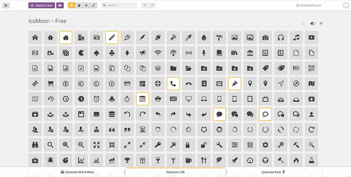
Clicking on the purple button on the top of the page, you can access the IcoMoon App.
Then, you can select the already-made icons of IcoMoon itself or import icons made by you by clicking on the purple button and adding them. If no error message is returned, your icons are ready to be installed in your projects.
Fixing problems
In most cases, it will be a message telling you that IcoMoon ignores strokes when generating fonts or CSH files. That means that you should convert it to outlines.
If you have tried to import a text, you should know that text elements get ignored too, so you should turn them into fills. Furthermore, you should revise your design to identify whether strokes are overlapping one another, and every stroke must be one single colour.
Tips on which icons to choose
What makes one or the other “better”, in some cases, depends on the circumstance in which it is being used. If you need many icons without much style modification, icon fonts can work well for you. For customization and animation, it’s better to use SVGs. Especially if you require full control over colors, smooth transitions, and animation of various icon parts. In short:
Icon font vs. SVG comparison shows that SVGs are more reliable, scalable, and rendered faster. That is why SVGs are becoming the new standard of web icons and a W3C Recommendation.